Formatting Charts
Learn about:
Use the chart formatting panel
Stack multiple measures on a bar, column, or waterfall chart
Display values on a bar or column chart
Change a Waterfall chart from vertical to horizontal
Use the chart formatting panel
Formatting legends, tooltips, display values, X and Y axis, and conditionals are all done using the Chart Formatting panel.
To get to the Chart Formatting panel:
- Click Self Service on the Insights Navigation Bar.
- Click Edit.
- Click the dashlet and then click the Edit button.

- Click
'Edit in Visualizer'.
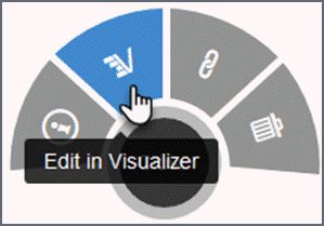
- In
report edit mode, click 'Chart Formatting'
 on the toolbar. The Chart Formatting window displays.
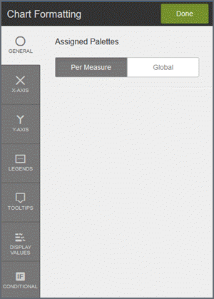
Legends
On the Chart Formatting window, click 'Legends'.
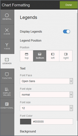
- Display legends: Toggle on or off.
- Change the legend position.
- Choose the text.
- Change the background color.
- Format the border.
- Click Done.
Format display values
When you format a display value on the Chart Formatting panel, the values you enter override formatting at the data level.
Tip: Some display values do not apply to charts that use percentage values, such as pie, donut, or semi-donut charts. For example, units, suffix, and currency do not apply to a pie chart, but would apply to a bar chart.
- On the Chart Formatting panel, click the Display Values tab.
- On the Display Values panel, set values for all measures and/or each measure.
- Click 'All Display Values'.

- Click a measure
to apply formatting specific to the measure. Specify the
units, suffix, decimal precision, and currency sign to apply to the measure.
Tip: You cannot specify font formats for each measure. Use 'All Display Values' to specify font formatting.
- Click Back.
- Iterate for each measure.
- Click Done.
Format tooltips
When you format tooltip values on the Chart Formatting panel, the values you enter override formatting at the data level.
Use Tooltips to change the font style, units, suffix, decimal precision, and currency symbol.
Tip: By default, tooltips show a black background that cannot be changed.
- On the Chart Formatting
panel, click the Tooltips tab.
If there is only one measure, its formatting options display.
If there are multiple measures, text formatting for all of them display at the top. Later you can select individual measures to format the other items.
- Check which
measures and attributes display in the tooltip.

- Change the font color, face, background highlight, size, and style of the tooltip text.
- Format the
data:
- Change the units.
- If appropriate, change the suffix to percentage.
- Set the decimal display.
- Choose a currency prefix.
- Click Done.
Apply conditional formatting
Create a chart that includes a color attribute.
- On the Chart Formatting panel, click the Conditional tab. By default the panel opens in the Basic tab with the conditional toggled on.
- Select color overrides. For example, conditions when using a time dimension.
- Optionally, click the Advanced tab for expression -based conditional formatting.
- When you are done, click Apply.
Use chart settings
Stack multiple measures on a bar, column, or waterfall chart
By default, multiple measures are grouped on bar, column, or waterfall charts. You can change from grouped to stack or percentage.
- In
the edit report mode, click Chart Settings in the toolbar.

- Change the
measure formatting.

Display values on a bar or column chart
- In
the edit report mode, click Chart Settings in the toolbar.

- Toggle Display
Values to on.
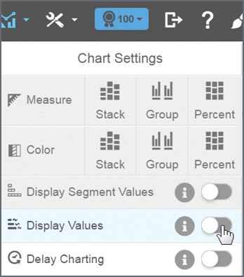
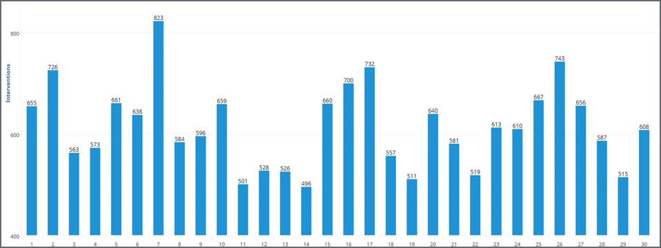
The value of the measure displays at the end of the bars in a column or bar chart. If you have a color attribute, you can display the segment values.
Change a Waterfall chart from vertical to horizontal
By default, a waterfall chart has a vertical orientation. To change it to horizontal, click Chart Settings and toggle Horizontal Waterfall to on.

Formatting axis
Change axis label text
In Edit mode, double-click on the X or Y axis on your chart.
Type the label you would like to use and then click the checkmark.

Tips:
- To remove the label, delete the text and click the checkmark.
- To restore a label, click the reset icon.
- Labels that overlap may not display properly.
Merge or split multiple axis
If the chart has multiple measures that use the same basic data types and ranges, merge the axis. (By default, Visualizer may automatically merge some axis.) Merging the axis will make the chart easier to read and understand.
- In the edit mode, hover over the axis and click the edit icon.
- Click 'Merge all Axis' (right or left depending
on where the axis sits).

- To unmerge,
hover over the axis and click the edit icon. Click 'Split Axis'.

Move axis left/right up/down
- In the Edit mode, hover over the axis and click the edit icon.
- For X axis, click 'Move Right' or 'Move Left'.
- For Y axis, click 'Move Up' or 'Move Down'.
Format X Axis Labels
- Click Chart Formatting
 on the toolbar.
 - On the Chart Formatting
panel, click X axis.
- Display the X axis: Toggle on or off.
Main label: Change the font face, style, size, color, or background highlight.
Tick mark label: Change the font face, style, size, color, or background highlight.
Baseline rule: Change the color, thickness, and toggle on or off.
Data type: Change the data formatting - units, suffix to percentage, decimal precision, currency prefix.
- Click Done.
Format Y axis labels
- Click Chart Formatting
 on the toolbar.
 - On the Chart Formatting
panel, click Y axis.
- Display the Y axis: Toggle on or off.
Main label: Change the font face, style, size, color, or background highlight.
Tick mark label: Change the font face, style, size, color, or background highlight.
Grid lines: Change the color, thickness, and toggle on or off.
Limits: By default the Y axis limits are set to automatic. You can set them to start at zero or manually enter the number of axis ticks and the min and max value range.
Data type: Change the data formatting - units, suffix to percentage, decimal precision, currency prefix.
- Click Done.